Cohort Analysis in Practice: How to Read Retention Curves and Forecast Churn
A SaaS CEO once showed me a dashboard: "Retention is 78%, we're doing great." I asked to break it down by cohorts. Turns out, the cohort from 6 months ago was retaining at 85%, while the last three cohorts were at 60%. Overall retention looked healthy because old, loyal users were masking the churn of new ones. The company didn't know it had a problem until cohort analysis revealed the real picture.
This is the trap of averages. And it's exactly why cohort analysis isn't "advanced analytics for big companies" — it's a fundamental tool for any product with recurring revenue.
Why Cohort Analysis When You Already Have Overall Retention
Overall retention rate is a hospital average. It hides at least three problems:
New user growth masks old user churn. If 1,000 new users arrive every month while 300 old ones leave, the total base grows and retention "on average" looks fine. But your product is losing a third of its customers, and the moment growth slows — the base starts shrinking.
Product changes are invisible. You launched a new onboarding 3 months ago. Did it help? Overall retention won't tell you — it mixes users of different tenure. Only comparing cohorts before and after the change shows the effect.
Different channels attract different users. Organic users might retain at 70%, while paid advertising brings users who retain at 40%. Average retention of 55% hides this gap.
Cohort analysis solves all three: it groups users by the time of their first meaningful event (registration, first payment, first session) and tracks each group separately.
Building a Retention Curve Step by Step
Step 1. Define Your Cohort
A cohort is a group of users united by the date of their first meaningful event.
| Cohort Type | When to Use | Example |
|---|---|---|
| Registration date | Freemium, mobile apps | "Everyone who registered in January 2025" |
| First payment date | SaaS with trial, subscriptions | "Everyone who first paid in January 2025" |
| First action date | Marketplaces, transactional models | "Everyone who made their first purchase in January" |
The choice depends on your business model. For subscription SaaS, I recommend cohorts by first payment — it filters out users who registered but never paid.
Step 2. Choose Your Period
- Daily cohorts — for mobile apps and games where activity is measured in days
- Weekly — for products with multi-day usage cycles
- Monthly — for SaaS, subscriptions, B2B products. This is the most common choice
Step 3. Calculate Retention for Each Cohort
Retention formula for month :
Example calculation for the "January 2025" cohort (initial size: 500 users):
| Month | Active | Retention |
|---|---|---|
| M0 (January) | 500 | 100% |
| M1 (February) | 340 | 68% |
| M2 (March) | 265 | 53% |
| M3 (April) | 230 | 46% |
| M4 (May) | 215 | 43% |
| M5 (June) | 210 | 42% |
| M6 (July) | 205 | 41% |
Step 4. Plot the Curve
A retention curve plots on the Y-axis (0-100%) against periods on the X-axis. The shape of the curve tells you more about your product than any average metric.
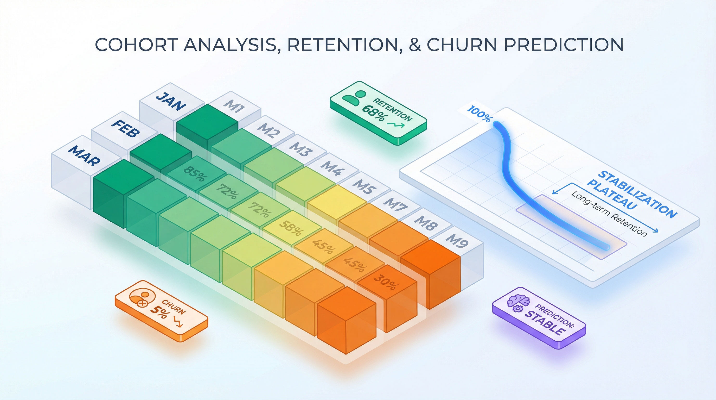
Reading the Heatmap: Retention Patterns
A cohort analysis heatmap is a table where rows are cohorts, columns are periods, and cell color reflects retention (dark = high, light = low). Three patterns you need to recognize:
Healthy Curve: Rapid Drop Then Plateau
M0    M1    M2    M3    M4    M5    M6    M7    M8    M9    M10   M11
100%  65%   50%   43%   40%   38%   37%   36%   35%   35%   34%   34%
The first 2-3 months see a sharp drop. Users who weren't a good fit leave. After that, the curve flattens to a plateau. The plateau signals product-market fit: remaining users found value and stay long-term.
Plateau levels depend on product category:
| Category | Typical Plateau (M12) |
|---|---|
| B2B Enterprise SaaS | 85-95% |
| B2B SMB SaaS | 60-75% |
| B2C SaaS (subscriptions) | 30-50% |
| Mobile apps | 15-25% |
| E-commerce (repeat purchases) | 20-35% |
Alarming Curve: Slow Drop Without Plateau
M0    M1    M2    M3    M4    M5    M6    M7    M8    M9    M10   M11
100%  80%   68%   58%   49%   42%   36%   31%   27%   23%   20%   17%
The curve never reaches a plateau — churn continues indefinitely. At first glance, M1 = 80% looks excellent. But after 12 months, only 17% remain. This is the "silent" pattern: there's no dramatic crash to trigger alarm bells, but the product steadily loses users. Typical cause — the product solves a one-time problem rather than creating a habit.
Excellent Curve: Retention Growth (Smile Curve)
M0    M1    M2    M3    M4    M5    M6    M7    M8    M9    M10   M11
100%  55%   45%   42%   40%   41%   43%   45%   47%   48%   49%   50%
A rare and valuable pattern. After initial churn, retention starts growing. This means remaining users activate others (virality), or the product becomes more valuable over time (network effects). The smile curve is a powerful signal to investors.
Comparing Cohorts on a Heatmap
Let's say you have three cohorts. The heatmap reveals differences immediately:
| Cohort | M0 | M1 | M2 | M3 | M4 | M5 | M6 |
|---|---|---|---|---|---|---|---|
| Jan 2025 | 100% | 62% | 48% | 41% | 38% | 36% | 35% |
| Feb 2025 | 100% | 68% | 55% | 49% | 46% | 44% | 43% |
| Mar 2025 | 100% | 71% | 58% | 52% | — | — | — |
February and March cohorts retain better. What happened? Maybe you launched a new onboarding, changed pricing, or acquired users from a different channel. Cohort analysis answers the question "what's working" that overall retention can't.
Churn Rate: The Other Side of Retention
Retention and churn are two sides of the same coin, but there are nuances.
Gross Churn vs Net Churn
The difference matters. If gross churn = 8%, but 2% of users come back (reactivation through email campaigns, promotions), then net churn = 6%. For financial modeling, use net churn — it's more realistic.
Revenue Churn vs Logo Churn
Logo churn counts lost customers. Revenue churn counts lost revenue. These can diverge dramatically:
| Month | Customers Lost | Revenue Lost | Logo Churn | Revenue Churn |
|---|---|---|---|---|
| January | 15 of 300 | 15,000 | 5.0% | 5.0% |
| February | 12 of 285 | 14,250 | 4.2% | 16.8% |
In February, fewer customers left, but revenue churn spiked — because the ones who left were large accounts. Revenue churn matters more for P&L; logo churn matters more for understanding product issues.
Net Revenue Retention (NRR)
Even more important is NRR, which accounts for expansion (upsell, cross-sell):
NRR > 100% is every SaaS company's dream: you earn more from existing customers than you lose to churn. Benchmark for B2B SaaS is 110-130%.
Calculating Monthly Churn from a Retention Curve
Example:
| Month | Retention | Monthly Churn |
|---|---|---|
| M0 | 100% | — |
| M1 | 68% | 32% |
| M2 | 53% | 22% |
| M3 | 46% | 13% |
| M4 | 43% | 6.5% |
| M5 | 42% | 2.3% |
| M6 | 41% | 2.4% |
See the pattern? Monthly churn decreases over time. This is typical — early churn of "casual" users is high, while those who remain leave less frequently. An averaged 5% monthly churn doesn't capture this dynamic.
How Retention Impacts P&L and LTV
A difference in retention that seems minor (5 percentage points) changes LTV dramatically over a 36-month horizon.
LTV Through the Retention Curve
The traditional formula assumes constant churn. A more precise formula sums discounted ARPU across the retention curve:
where is the monthly discount rate (typically 1-2%).
Without discounting:
Table: How 5% Difference in Retention Changes LTV
Two curves: Scenario A — plateau at 35%, Scenario B — plateau at 40%. ARPU = $25/mo.
| Month | Retention A | Retention B | Difference |
|---|---|---|---|
| M0 | 100% | 100% | 0% |
| M1 | 65% | 70% | +5% |
| M3 | 42% | 47% | +5% |
| M6 | 36% | 41% | +5% |
| M12 | 35% | 40% | +5% |
| M24 | 35% | 40% | +5% |
| M36 | 35% | 40% | +5% |
Now let's calculate LTV (sum of ARPU * R(n) over 36 months):
| Metric | Scenario A | Scenario B | Difference |
|---|---|---|---|
| Sum R(n), 36 mo | 14.3 | 16.4 | +15% |
| LTV (ARPU $25) | $358 | $410 | +$52 (+15%) |
Over 36 months, the difference is 15%. But looking at LTV through 60 months:
| Metric | Scenario A | Scenario B |
|---|---|---|
| Sum R(n), 60 mo | 22.7 | 26.2 |
| LTV (ARPU $25) | $568 | $655 |
| Difference | — | +$87 (+15%) |
Now take a more radical difference — plateau at 30% vs 45%:
| Metric | Plateau 30% | Plateau 45% | Difference |
|---|---|---|---|
| LTV, 36 mo | $303 | $463 | +53% |
| LTV, 60 mo | $480 | $745 | +55% |
A 15-percentage-point difference in plateau retention yields 50%+ difference in LTV. This is why retention is the most sensitive parameter in any financial model.
Forecasting Revenue by Cohort
Revenue in month is the sum of ARPU across all active users from all cohorts:
where is cohort size, and is retention after months.
Example (ARPU = $25, cohort growth +10%/mo):
| Month | New (cohort) | Active from M0 | Active from M1 | Active from M2 | Total Active | Revenue |
|---|---|---|---|---|---|---|
| M0 | 200 | 200 | — | — | 200 | $5,000 |
| M1 | 220 | 136 | 220 | — | 356 | $8,900 |
| M2 | 242 | 106 | 150 | 242 | 498 | $12,450 |
| M3 | 266 | 92 | 117 | 165 | 640 | $16,000 |
Retention curve used: M0=100%, M1=68%, M2=53%, M3=46%. Each row accumulates cohorts. Revenue grows faster than cohort size because older cohorts continue generating income.
Cohort Retention in Your Financial Model
From Fixed Churn to Retention Curve
In my experience, I've seen dozens of financial models with fixed churn: "5% per month." It's convenient for calculation, but it distorts reality in two ways:
-
Overestimates late-stage churn. If the real curve plateaus, fixed churn keeps "killing" users who would actually stay.
-
Underestimates early churn. The first months are the most dangerous. Real churn might be 30-40% in M1, but the fixed model shows 5%.
Forecast comparison:
| Month | Fixed Churn 5% | Retention Curve | Difference |
|---|---|---|---|
| M0 | 1,000 | 1,000 | 0 |
| M1 | 950 | 680 | -270 |
| M3 | 857 | 460 | -397 |
| M6 | 735 | 410 | -325 |
| M12 | 540 | 380 | -160 |
| M24 | 292 | 360 | +68 |
With 5% fixed churn, 292 out of 1,000 remain after 24 months. The retention curve with a 37% plateau gives 360. In the early stage, fixed churn is optimistic (underestimates churn); in the late stage, it's pessimistic (overestimates churn). This distorts both the P&L and revenue forecast and the LTV calculation.
Seasonality and Cohorts
Retention depends on season. Users acquired in January (after the New Year advertising peak) may retain worse than autumn cohorts. Reasons:
- Different traffic quality (impulse vs. intentional installs)
- Seasonal usage fluctuations (holidays, vacations)
- Promo cohorts with inflated expectations
In a financial model, this is accounted for with a seasonality multiplier on the retention curve:
where is the seasonal coefficient for cohort (0.8-1.2).
In Practice: Visualization and Tools
Cohort analysis is exactly as useful as it is easy to read and update. In practice, you need three things:
1. Heatmap
A color-coded table where you can instantly see:
- Which cohorts retain better or worse
- At which month the curve reaches its plateau
- Whether there's a trend (improvement or deterioration over time)
2. Retention Curve Overlay
Multiple curves on one chart. Lets you visually compare cohorts and see the effect of product changes.
3. Connection to P&L
The retention curve shouldn't live in a separate report — it should be part of the financial model. Change the curve, see the impact on LTV, revenue, and break-even.
In ProductWave, cohort analysis is integrated into the P&L model: you set a retention curve in model parameters, and it automatically flows into active user calculations, revenue, and LTV. The Cohort Heatmap widget on the dashboard shows a retention heatmap by cohort, and the "Cohort retention" toggle in model settings lets you compare forecasts using fixed churn versus the retention curve.
For more on how the retention curve affects unit economics — CAC, LTV, Payback — see the unit economics guide. For building a complete P&L model with cohort retention, check the step-by-step guide.
Three Principles of Cohort Analysis
Principle 1: Don't trust averages — look at cohorts. Average retention masks reality: new user growth hides old user churn, and aggregated metrics don't reveal the effect of product changes. Cohort analysis is the only way to see what's actually happening. This applies to churn as well: revenue churn matters more than logo churn, and NRR > 100% is the benchmark worth targeting.
Principle 2: The retention curve must reach a plateau. A plateau signals product-market fit. If the curve never flattens, the product has no loyal user core, and no amount of marketing will fix that. Even a 5% difference in plateau level changes LTV by 50%+ over a 36-60 month horizon. Retention is the most sensitive parameter in any financial model.
Principle 3: Use a retention curve in your financial model, not fixed churn. A fixed 5% monthly churn overestimates the early user base (real M1 churn can be 30-40%) and underestimates the late one (at the plateau, churn stabilizes at 2-3%). A retention curve produces realistic forecasts and correct LTV calculations.
If you want to see the difference in practice, give ProductWave a try. Enable cohort retention in model settings and compare the forecast against fixed churn. The difference in results usually surprises people.
January 5, 2026
AnalyticsProduct ManagementSaaSGuide